Tailwind CSS-এর সবচেয়ে বড় সুবিধাগুলোর একটি হলো, আপনি খুব দ্রুত একটা সুন্দর UI তৈরি করতে পারেন utility classes ব্যবহার করে। কিন্তু একটা real-world project যখন বড় হতে শুরু করে, তখন শুধু bg-blue-500, text-xl বা rounded-lg ব্যবহার করলেই কাজ শেষ হয় না।
একটা বড় application-এ সাধারণত নির্দিষ্ট color palette, typography, spacing, border radius, shadows, breakpoints এবং অন্যান্য design decisions বারবার ব্যবহার করতে হয়।
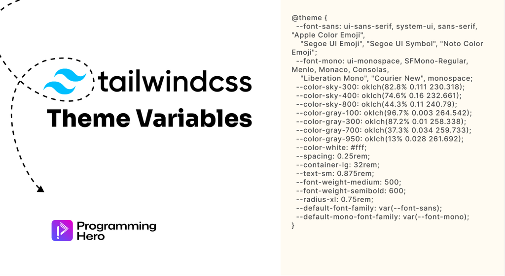
এই reusable design decisions-গুলোকে একসাথে manage করার জন্য Tailwind CSS v4-এ এসেছে theme variables এবং @theme directive।
Tailwind CSS v4-এর CSS-first configuration approach-এর কারণে এখন অনেক customization JavaScript configuration file-এর পরিবর্তে সরাসরি CSS-এ করা যায়।
@theme ব্যবহার করে আপনি নিজের design tokens define করতে পারেন এবং সেই tokens-এর ওপর ভিত্তি করে নতুন Tailwind utility classes ও responsive variants তৈরি করতে পারেন।
এই guide-এ আমরা দেখব Tailwind CSS theme variables কী, @theme কীভাবে কাজ করে, কীভাবে custom colors ও fonts তৈরি করবেন, কীভাবে default theme override করবেন এবং কখন @theme বনাম :root ব্যবহার করা উচিত।
What Are Theme Variables in Tailwind CSS?
সহজভাবে বললে, theme variables হলো Tailwind CSS-এর design tokens।
একটি design system-এ যেসব reusable values বারবার ব্যবহার করা হয় যেমন:
- Colors
- Font families
- Font sizes
- Font weights
- Spacing
- Breakpoints
- Border radius
- Shadows
- Animation timing
- Container sizes
এসব values theme variables হিসেবে define করা যায়।
Tailwind CSS v4-এ এগুলো @theme directive-এর মাধ্যমে CSS-এ define করা হয়।
উদাহরণ হিসেবে ধরুন, আপনার project-এর primary brand color হলো একটি custom green:
@import "tailwindcss";

@theme {
  --color-brand: #00cc76;
}
এখন Tailwind আপনার জন্য bg-brand, text-brand, border-brand-এর মতো utility classes তৈরি করতে পারে।
<button class="bg-brand text-white">
  Get Started
</button>
এখানেই @theme সাধারণ CSS variable-এর চেয়ে আলাদা। আপনি শুধু একটা variable define করছেন না; Tailwind সেই variable-এর namespace বুঝে corresponding utility API-ও তৈরি করছে।
How Does the @theme Directive Work?
Tailwind CSS v4-এ @theme হলো একটি special Tailwind directive। একটি basic example দেখুন:
@import "tailwindcss";

@theme {
  --color-primary: #00cc76;
  --color-secondary: #111827;
  --font-display: "Inter", sans-serif;
}
এখানে তিনটি theme variable define করা হয়েছে।
--color-primary
--color-secondary
--font-display
Variable-এর নামের prefix বা namespace দেখে Tailwind বুঝতে পারে কোন ধরনের utility তৈরি করতে হবে। যেমন:
--color-primary
থেকে color-related utilities তৈরি হবে। অন্যদিকে:
--font-display
থেকে font-family utility তৈরি হবে। তাই HTML-এ আপনি লিখতে পারবেন:
<h1 class="font-display text-primary">
  Build Better Products
</h1>
অর্থাৎ @theme শুধু values store করে না এগুলোকে Tailwind-এর utility class system-এর সঙ্গে connect করে।
Why Did Tailwind CSS v4 Introduce Theme Variables?
Tailwind CSS v4-এর অন্যতম বড় পরিবর্তন হলো CSS-first configuration।
আগের versions-এ custom colors, fonts, spacing বা breakpoints configure করার জন্য developers সাধারণত tailwind.config.js ব্যবহার করতেন।
Tailwind CSS v4 সেই workflow-কে অনেক বেশি CSS-native করেছে। এখন আপনি সরাসরি আপনার stylesheet-এ লিখতে পারেন:
@theme {
  --color-brand: #00cc76;
  --font-heading: "Inter", sans-serif;
}
এতে configuration এবং styling-এর মধ্যে context switching কমে যায়। Tailwind-এর official v4 announcement অনুযায়ী, CSS-first configuration-এর লক্ষ্য ছিল Tailwind-কে JavaScript library-এর মতো না দেখে modern CSS-এর আরও কাছাকাছি নিয়ে আসা।
Understanding Theme Variable Namespaces
Theme variables-এর সবচেয়ে গুরুত্বপূর্ণ বিষয়গুলোর একটি হলো namespace।
একটি namespace নির্ধারণ করে variable থেকে কোন ধরনের utility বা variant তৈরি হবে। উদাহরণ হিসেবে:
| Namespace | Used For |
|---|---|
--color-* | Colors |
--font-* | Font families |
--text-* | Font sizes |
--font-weight-* | Font weights |
--tracking-* | Letter spacing |
--leading-* | Line heights |
--spacing-* | Spacing and sizing |
--breakpoint-* | Responsive breakpoints |
--container-* | Container queries and sizes |
--radius-* | Border radius |
--shadow-* | Box shadows |
--blur-* | Blur utilities |
--animate-* | Animation utilities |
এই namespace system-এর কারণে Tailwind বুঝতে পারে কোন variable থেকে কী ধরনের utility তৈরি করতে হবে।
Custom Colors with Tailwind CSS Theme Variables
ধরুন আপনার website-এর brand colors হলো green, dark এবং orange। আপনি এগুলো এভাবে define করতে পারেন:
@import "tailwindcss";

@theme {
  --color-brand: #00cc76;
  --color-dark: #111827;
  --color-accent: #f97316;
}
এরপর HTML-এ:
<div class="bg-brand text-white">
  Programming Hero
</div>
অথবা:
<h1 class="text-dark">
  Learn Programming
</h1>
এমনকি:
<button class="border-accent">
  Start Learning
</button>
এখানে সবচেয়ে interesting ব্যাপার হলো, আপনাকে আলাদা করে .bg-brand, .text-dark বা .border-accent CSS class লিখতে হচ্ছে না। Theme variable define করার পর Tailwind সেই utility API তৈরি করে দেয়।
Creating Custom Fonts with @theme
একইভাবে আপনি custom font family define করতে পারেন।
@theme {
  --font-display: "Poppins", sans-serif;
  --font-body: "Inter", sans-serif;
}
এখন:
<h1 class="font-display">
  Build Your Future
</h1>

<p class="font-body">
  Learn modern web development.
</p>
Tailwind-এর default theme-এ --font-sans, --font-serif এবং --font-mono-এর মতো theme variables রয়েছে। আপনি নিজের font variable যোগ করলে corresponding utility class-ও available হয়ে যায়।
Custom Breakpoints with Tailwind CSS
Theme variables শুধু colors আর fonts-এর জন্য নয়। আপনি responsive breakpoints-ও customize করতে পারেন। ধরুন আপনি একটি custom 3xl breakpoint চান:
@theme {
  --breakpoint-3xl: 120rem;
}
এখন আপনি ব্যবহার করতে পারবেন:
<div class="grid grid-cols-2 md:grid-cols-4 3xl:grid-cols-6">
  ...
</div>
এখানে 3xl: variant আপনার custom breakpoint-এর ওপর ভিত্তি করে কাজ করবে।
এটি useful যখন আপনার design system-এর responsive behavior Tailwind-এর default breakpoints থেকে আলাদা।
Custom Spacing with Theme Variables
Spacing scale-ও theme variables দিয়ে customize করা যায়। ধরুন আপনার design system-এ custom spacing value দরকার:
@theme {
  --spacing-18: 4.5rem;
}
এরপর:
<div class="p-18">
  Content
</div>
এখানে p-18 আপনার custom spacing token ব্যবহার করবে। একই concept sizing utilities-এর ক্ষেত্রেও প্রযোজ্য।
এভাবে project-এর spacing system এক জায়গা থেকে maintain করা যায়।
Custom Border Radius and Shadows
একটি polished UI তৈরি করার সময় border radius এবং shadows-ও design system-এর অংশ। আপনি custom radius define করতে পারেন:
@theme {
  --radius-card: 1.25rem;
}
তারপর:
<div class="rounded-card">
  ...
</div>
একইভাবে custom shadow:
@theme {
  --shadow-card: 0 10px 30px rgb(0 0 0 / 0.08);
}
তারপর:
<div class="shadow-card">
  ...
</div>
এর ফলে পুরো application-এ একই visual language maintain করা সহজ হয়।
@theme vs :root: What’s the Difference?
এখানেই অনেক developer প্রথমবার একটু confused হন। দুটোতেই CSS variables define করা যায়, কিন্তু তাদের purpose এক নয়।
Using :root
:root {
  --brand-color: #00cc76;
}
এটি একটি regular CSS custom property। আপনি CSS-এ এটি ব্যবহার করতে পারবেন:
.button {
  background: var(--brand-color);
}
কিন্তু Tailwind automatically bg-brand-color utility তৈরি করবে না।
Using @theme
@theme {
  --color-brand: #00cc76;
}
এটি Tailwind-এর theme variable। এটি define করার ফলে corresponding Tailwind utilities তৈরি হতে পারে:
<button class="bg-brand">
  Click Me
</button>
তাই সহজভাবে মনে রাখতে পারেন:
@themeব্যবহার করুন যখন variable-টি Tailwind utility বা variant-এর অংশ হবে।
আর এমন কোনো CSS variable দরকার হলে যার সঙ্গে Tailwind utility class তৈরি করার প্রয়োজন নেই, সেখানে :root বেশি appropriate হতে পারে।
Theme Variables Are Also CSS Variables
Tailwind CSS v4-এর আরেকটি interesting feature হলো, theme variables শেষ পর্যন্ত regular CSS custom properties হিসেবেও available থাকে। ধরুন:
@theme {
  --color-brand: #00cc76;
}
আপনি Tailwind class দিয়ে ব্যবহার করতে পারবেন:
<div class="bg-brand">
  Hello
</div>
আবার regular CSS-এও:
.custom-element {
  background-color: var(--color-brand);
}
ব্যবহার করতে পারবেন।
এটি বিশেষভাবে useful যখন Tailwind-এর বাইরে custom CSS, JavaScript বা অন্য UI libraries-এর সঙ্গে একই design token ব্যবহার করতে হয়।
Tailwind-এর v4 architecture theme values-কে CSS variables হিসেবে expose করে, যাতে runtime-এও সেগুলো reference করা যায়।
Using Theme Variables in JavaScript
ধরুন আপনার application-এ animation library ব্যবহার করছেন। আপনার theme-এ:
@theme {
  --color-brand: #00cc76;
}
এখন JavaScript-based UI library-তেও CSS variable reference করা যায়:
<motion.div
  animate={{
    backgroundColor: "var(--color-brand)"
  }}
>
  Content
</motion.div>
এই approach-এর সুবিধা হলো, design token-এর actual value JavaScript code-এর মধ্যে hardcode করতে হচ্ছে না।
Design change করলে theme variable update করলেই related UI automatically update করতে পারে।
Extending the Default Tailwind Theme
Tailwind-এর default theme পুরোপুরি replace করার প্রয়োজন নেই। আপনি চাইলে existing theme-এর সঙ্গে নিজের variables যোগ করতে পারেন।
@import "tailwindcss";

@theme {
  --color-brand: #00cc76;
  --font-display: "Poppins", sans-serif;
}
এর ফলে Tailwind-এর default utilities থাকবে এবং আপনার custom utilities-ও available হবে।
এটি সাধারণ application-এর জন্য সবচেয়ে practical approach।
Overriding Default Theme Values
ধরুন আপনি Tailwind-এর default sm breakpoint পরিবর্তন করতে চান।
@theme {
  --breakpoint-sm: 30rem;
}
এখন sm: variant নতুন breakpoint অনুযায়ী কাজ করবে। একইভাবে default color-এর value-ও override করা যায়। উদাহরণ:
@theme {
  --color-blue-500: #2563eb;
}
এর ফলে আপনার project-এ blue-500-এর theme value পরিবর্তিত হবে।
Creating a Completely Custom Theme
কখনও কখনও আপনি Tailwind-এর default colors বা design tokens একদম ব্যবহার করতে চান না। সেক্ষেত্রে পুরো namespace reset করা যায়।
উদাহরণ:
@theme {
  --color-*: initial;

  --color-primary: #00cc76;
  --color-secondary: #111827;
  --color-accent: #f97316;
}
এখন default color utilities-এর পরিবর্তে আপনার defined color tokens ব্যবহার করা যাবে।
এটি বিশেষভাবে useful যখন আপনি একটি strict design system follow করছেন এবং project-এর বাইরে থেকে আসা default values ব্যবহার করতে চান না।
Using @theme inline
একটি advanced situation হলো যখন একটি theme variable অন্য একটি CSS variable reference করে। যেমন:
:root {
  --brand-font: "Inter";
}

@theme inline {
  --font-sans: var(--brand-font);
}
inline ব্যবহার করলে Tailwind generated utility-তে referenced variable-এর value directly ব্যবহার করার মতো behavior পাওয়া যায়।
এটি variable scope এবং resolution-এর কিছু unexpected behavior এড়াতে সাহায্য করতে পারে, বিশেষ করে যখন variables nested elements-এ define করা হয়।
Sharing a Tailwind Theme Across Multiple Projects
একই company বা team-এর একাধিক project থাকলে theme variables আরও powerful হয়ে ওঠে। ধরুন আপনার একটি shared theme.css আছে:
@theme {
  --color-primary: #00cc76;
  --color-secondary: #111827;
  --font-body: "Inter", sans-serif;
  --radius-card: 1rem;
}
অন্য project-এ সেটি import করা যায়:
@import "tailwindcss";
@import "../brand/theme.css";
এভাবে একই design tokens একাধিক application-এ share করা সম্ভব।
Monorepo setup বা design system package-এর ক্ষেত্রে এই approach বেশ useful, কারণ একই brand colors, typography এবং spacing rules বিভিন্ন project-এ reuse করা যায়।
Theme Variables and Design Systems
এখন একটু বড় picture-এ আসা যাক। একটি design system-এর লক্ষ্য হলো developer-দের প্রতিবার নতুন করে design decision নেওয়া থেকে মুক্ত রাখা।
ধরুন আপনার company design system বলছে:
Primary Color → Green
Border Radius → 12px
Body Font → Inter
Heading Font → Poppins
Spacing → 4px based scale
এসব value যদি পুরো codebase-এ hardcoded থাকে, তাহলে future-এ design change করা কঠিন হবে। কিন্তু এগুলো theme variables হিসেবে রাখলে:
@theme {
  --color-primary: #00cc76;
  --font-body: "Inter", sans-serif;
  --font-heading: "Poppins", sans-serif;
  --radius-card: 0.75rem;
}
তারপর পুরো application সেই tokens-এর ওপর build করা যায়।
এটাই theme variables-এর আসল power এগুলো শুধু Tailwind customization-এর feature নয়; এগুলো আপনার design system-এর foundation হিসেবেও কাজ করতে পারে।
Common Mistakes to Avoid
1. Every Value as a Theme Variable
প্রতিটি ছোট value-এর জন্য theme variable তৈরি করার দরকার নেই। যে values project-wide design decisions হিসেবে reuse হবে, সেগুলো theme-এ রাখাই বেশি practical।
2. Confusing @theme with :root
সব CSS variable-কে @theme-এর মধ্যে রাখার দরকার নেই।
যে variable-এর সঙ্গে Tailwind utility বা variant দরকার, সেটি @theme-এ রাখুন। অন্য সাধারণ CSS variables :root-এ রাখা যেতে পারে।
3. Following Old Tailwind v3 Tutorials Without Checking v4
Tailwind CSS v4 configuration workflow অনেকটাই পরিবর্তন করেছে।
বিশেষ করে tailwind.config.js, theme() function এবং CSS-first configuration নিয়ে v4-এর approach আগের versions থেকে আলাদা।
Tailwind-এর current documentation অনুযায়ী, v4-এ theme values access করার জন্য CSS variables ব্যবহার করাই preferred approach এবং পুরোনো theme() function deprecated।
AI-Driven
AI-Driven Full Stack Web Engineering with Programming Hero Batch 15

Tailwind CSS Theme Variables Best Practices
একটি maintainable Tailwind CSS project-এর জন্য কয়েকটি বিষয় মাথায় রাখতে পারেন।
Use semantic names. --color-primary বা --color-danger অনেক ক্ষেত্রে --color-green-500-এর চেয়ে maintain করা সহজ, কারণ design পরিবর্তন হলেও semantic name একই থাকতে পারে।
Keep your design tokens centralized. Colors, typography, spacing এবং other reusable values scattered না রেখে একটি predictable theme structure-এ রাখুন।
Use @theme for Tailwind-connected tokens. যে value থেকে utility বা variant তৈরি করতে চান, সেটি @theme-এ define করুন।
Avoid unnecessary customization. Tailwind-এর default theme যথেষ্ট useful। প্রয়োজন না থাকলে পুরো default theme replace করার দরকার নেই।
Think in terms of a design system. Theme variables শুধু আজকের UI-এর জন্য নয়; ভবিষ্যতে পুরো product-এর consistency maintain করার জন্যও তৈরি করুন।
Final Thoughts
Tailwind CSS v4-এর @theme system প্রথমে শুধু configuration-এর নতুন syntax মনে হতে পারে। কিন্তু একটু গভীরে গেলে বোঝা যায়, এটি তার চেয়ে অনেক বেশি কিছু।
@theme আপনার design tokens-কে Tailwind-এর utility system-এর সঙ্গে connect করে। আপনি custom colors, fonts, spacing, breakpoints, shadows, animations এবং অন্যান্য design decisions এক জায়গা থেকে manage করতে পারেন।
আর সবচেয়ে interesting বিষয় হলো এই theme values একই সঙ্গে CSS variables হিসেবেও ব্যবহার করা যায়। ফলে Tailwind utilities, custom CSS এবং JavaScript-based UI libraries সব জায়গায় একই design tokens reuse করা সম্ভব।
তাই Tailwind CSS v4 ব্যবহার করে যদি আপনি শুধু কয়েকটি utility class দিয়ে UI বানানোর বদলে scalable এবং consistent design system তৈরি করতে চান, তাহলে @theme এবং theme variables ভালোভাবে বোঝা অত্যন্ত গুরুত্বপূর্ণ।
Tailwind-এর v4 workflow-এর সবচেয়ে বড় shift-গুলোর একটি হলো configuration-কে JavaScript file থেকে CSS-এর কাছাকাছি নিয়ে আসা। আর সেই workflow-এর কেন্দ্রে রয়েছে theme variables।