Imagine তুমি একটা webpage বানাচ্ছো। Image, text, buttons, সব ঠিকঠাক place করতে হবে। ঠিক এখানেই Grid vs Flex আসবে।
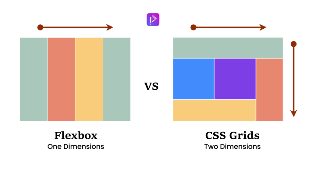
- Flex: Best for 1D layouts – row বা column।
- Grid: Best for 2D layouts – row + column একসাথে।
এই blog-এ আমি step-by-step দেখাবো কিভাবে Flex এবং Grid কাজ করে, কখন কোনটা use করা উচিত, এবং বাস্তব উদাহরণসহ দেখাবো।
Step 1: Understanding Flex – The Flexible Box
Flex হলো এমন একটা system যা container-এর ভিতরের items কে align এবং distribute করতে সাহায্য করে।
Example: Horizontal Navigation Bar
.navbar {
  display: flex;
  justify-content: space-between;
  align-items: center;
}
Explanation:
display: flex→ container কে Flex context-এ নিয়ে আসেjustify-content: space-between→ items evenly spread across main axisalign-items: center→ vertical alignment
When to use Flex:
- Simple row or column layouts
- Navigation menus, buttons, cards
- Centering items easily
Step 2: Understanding Grid – The Layout Master
Grid হলো 2D layout system, যা row + column একসাথে handle করে।
Example: Photo Gallery
.gallery {
  display: grid;
  grid-template-columns: repeat(3, 1fr);
  gap: 10px;
}
Explanation:
display: grid→ container কে Grid context-এ নিয়ে আসেgrid-template-columns: repeat(3, 1fr)→ 3 columns with equal widthgap: 10px→ spacing between items
When to use Grid:
- Complex layouts: photo galleries, dashboards
- Items spanning multiple rows or columns
Step 3: Grid vs Flex – Quick Comparison
| Feature | Flex | Grid |
|---|---|---|
| Dimension | 1D (row or column) | 2D (row + column) |
| Use case | Menus, navbars, cards | Galleries, dashboards, full-page layouts |
| Spacing control | Good | Excellent |
| Alignment | Easy | More control, advanced |
| Complexity | Simple | Slightly advanced |
Step 4: Step-by-Step Example: Building a Portfolio Page
ধরা যাক তুমি একটা portfolio page বানাচ্ছো।
- Header Navigation:
- Flex use করো, row-wise navigation।
.header {
  display: flex;
  justify-content: space-between;
  align-items: center;
}
- Gallery Section:
- Grid use করো, 3-column layout।
.gallery {
  display: grid;
  grid-template-columns: repeat(3, 1fr);
  grid-auto-rows: 200px;
  gap: 15px;
}
- Footer Links:
- Flex use করো again, row-wise alignment।
AI-Driven
Full Stack Web Engineering with Programming Hero Batch 14

Step 5: Combining Grid & Flex
- Header: Flex
- Gallery: Grid
- Card inside gallery: Flex (for text & buttons)
Pro Tip: Flex inside Grid বা Grid inside Flex common practice – modern responsive layouts-এর জন্য perfect।
Step 6: Responsive Layout Tips
- Flex naturally shrinks/grows items → good for responsive rows
- Grid with
auto-fit+minmax()→ flexible columns
.gallery {
  display: grid;
  grid-template-columns: repeat(auto-fit, minmax(200px, 1fr));
  gap: 15px;
}
- Gallery এখন screen size অনুযায়ী adjust হবে
Grid vs Flex – Which One to Use?
- Flex: 1D layouts – menus, cards, simple rows/columns
- Grid: 2D layouts – galleries, dashboards, complex page sections
- Pro Tip: Mix both for maximum flexibility
Flex gives easy alignment, Grid gives full control over 2D layout. Modern CSS often combines both for clean, responsive design.